Designing Emails that Convert
Email design is make-or-break when it comes to building brand loyalty and hitting your sales goals. Small design changes can add up to very big differences to your conversion rate, so you’ll want to spend time creating an email design strategy that works for your brand. If you’re brand-new to all this, or email design isn’t something that comes naturally to you - don’t worry, I’m here to help!
Let’s jump into some key design elements to consider to help your marketing emails convert.
All signs point to the CTA
Every email you send should have a clear objective. Maybe you want to alert customers to a limited-time offer, share a new styling guide or announce a collection launch. Your email design should guide the user’s eye to a call to action (CTA) that supports your goal - and drives conversions. You should use design elements like special fonts and bold buttons to help guide your customer’s eye and emphasize the CTA.
Your CTA should be clear both above the fold (so that it catches a customer’s eye from the moment they open the email) and should be reiterated further down in the email body, as well.
For example, here’s an email I received recently from Starface, which has an incredibly streamlined column design advertising a Build Your Own Bundle promotion. The entire email is clickable, the CTA is stated clearly in the header, and - if the customer still isn’t sure what action to take - there’s also a “Shop Now” button at the end of the email, reiterating Starface’s goal to get customers to their bundles promotion:
By contrast, here’s an email I received from Marcella, which actually has multiple CTAs. There’s the one above the brand logo - a GIF offering a free tee with purchase. And then there’s the actual body of the email, below, which is promoting a collection of geometric tops.
These messages should be in two separate emails! It’s hard to hold customer attention with marketing emails for any amount of time, so you need to make your content as to-the-point as possible. That takes us to tip number two.
You and I both know that not everyone visiting your online store will become a buyer.
But what if I could help you to bump up that percentage?
Clarity (and brevity) is key
Let’s be honest: no one has an attention span any more, and especially not for marketing emails. Although you may be tempted to share all of the information up-front, it’s much better to think of your email’s copy as a tasty snack that lures users to the full meal - which is your website!
Be sure to keep your email copy super clear and brief - I like no more than a couple hundred words - and break up long paragraphs into shorter, easily digestible chunks. If you have more information that you need to get across, you can always add a link to the relevant landing page or blog post on your site.
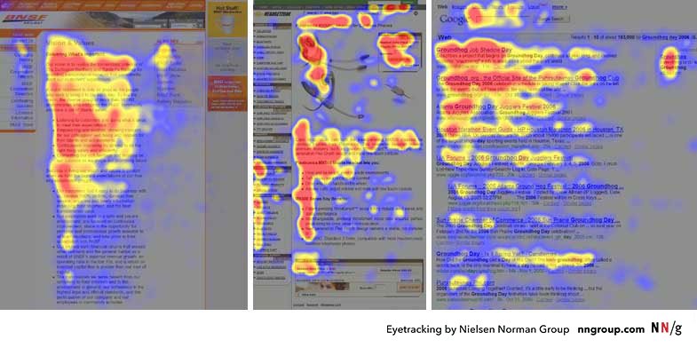
As an illustration of why concise copy is so important, here’s heat map data from a UX Study showing how human eyes track across differently formatted web pages’ copy:
Fascinating, right?! Remember this next time you’re writing email copy: by breaking up your email’s copy into short sections, you’re actually ensuring more of it gets read.
Make use of negative space + scale
You never want to crowd the customer’s eye as they scan your email for the most important information. Emails are often read on-the-go or on small screens, so it’s critical to use appropriately large copy, bold images, and plenty of negative space as a buffer.
You’ll especially want to make sure that the most important information (like your CTA!) is big, bold and easy to read. Don’t make your reader squint to understand the point of your email!
This email from Gabriela Hearst has copy that’s way too small - remember, at a minimum, your CTA needs to be readable at a glance, and that means scale is key:
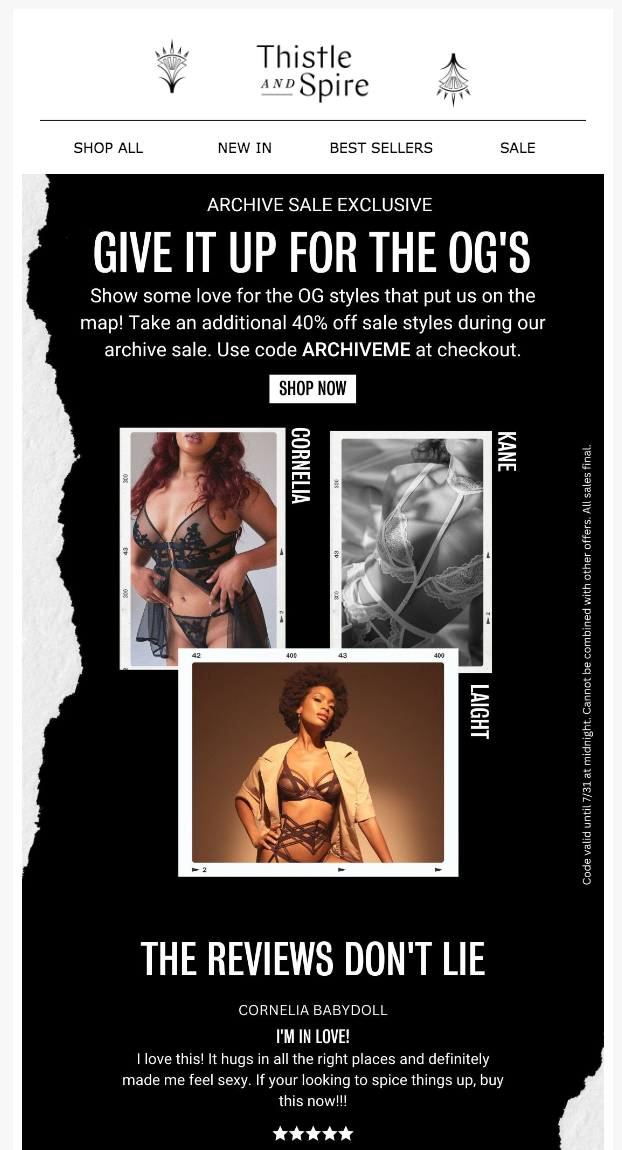
And this email from Thistle & Spire has way too much going on, design-wise - it could use more negative space, and pared-down copy:
On-point branding
Visual consistency builds trust, brand awareness - and literally makes your customers like you more. (It’s called the mere exposure effect - look it up!) This means you need to spend time developing - and then using - consistent fonts, color palettes, and overall vibes for your email marketing, and those vibes should be consistent with your website and social channels, as well.
I recommend choosing no more than two key fonts - a header and a body font - and a palette of five or so signature colors that you can mix and match. For extra branding credit (and to save some time long term), consider designing a few standard email templates that you can repurpose again and again.
Arq’s emails always stand out to me as so lovely and consistently branded - I love their simplicity, curvy section elements and muted color schemes:
Use visuals and movement for impact
On-point images are the best way to catch your reader’s attention. In my experience, most shoppers tend to click through to the website via an email’s images, with buttons coming in at a close second. This means that, not only should your images serve to draw the eye and illustrate your CTA, but they should also function as links that direct your users to the appropriate landing page.
Want to make even more of a visual impact? Create a simple GIF using several images, and open with that as the hero content in your email. GIFs draw the eye and, if your customers are anything like me, they’ll want to stick around and watch the pretty picture before clicking out of your email - which gives your content some valuable additional time to help make a sale.
Consider a mobile-first design approach
As discussed above, many - if not most - of your customers will be opening your emails on a mobile device with a teeny screen. Every design strategy we’ve discussed only becomes more important when scaled down for mobile. Before sending an email, make sure you’ve previewed it in both mobile and desktop views to ensure everything is working as expected.
Most email marketing platforms (like Klaviyo) now allow you to specify mobile- versus desktop- specific sections, so remember, if something really doesn’t work for one view or another you can probably tweak it accordingly. Keep your mobile layouts as streamlined as possible - this isn’t the place to be using tons of columns or other complicated text layouts.
Last but not least, remember - everything needs to be clickable on mobile, because users can (and do!) get frustrated if they have to aim for a tiny text link on an already-tiny screen. Make everyone’s life easy with big, bold buttons and linked images.
Have questions? Get in touch. I answer all messages personally.


