Best-selling collection page UX
This article is brought to you by a pain point I’ve noticed for some of my clients recently: collection page design. Collection pages are critical for your brand to get right as they’re the starting point of the customer’s browsing journey. Especially for apparel brands - where factors like size are a big consideration - you really need to ensure your collection pages are well-optimized to sell. Read on for all my best pointers to help you improve conversion rates on your e-comm site’s collection pages.
Check mobile formatting
The majority of (new) shoppers are going to encounter your site on a phone, which means mobile-first formatting is key.
Some key things to check: are the sizes and proportions of your collection page transferring properly to the mobile view? Is there anything you can streamline to make the smaller view less overwhelming? Are filtering options still easy to access?
While we always want to ensure site formatting is user-friendly, it becomes extra critical on smaller screen views. Take this example from Gap, which is, in my opinion, way too cluttered:
And contrast it with Levi’s, which is so much more streamlined. Also, note how the filtering menu doesn’t take up the entire page, making it much easier to click in and out of:
Take the time to really test out your mobile pages - as in, go through the entire browsing and purchasing process, multiple times, like you’re a shopper. Does everything work as expected? Are there any points where you find yourself rage-clicking or having a hard time accessing menus, filters, etc?
Include social proof
Many first-time browsers on your site will never make it as far as an individual product page. But a great way to increase the odds that they’ll click through is to include social proof at the collection page level.
Check out how Loops Beauty accomplishes this, with products marked “Best Seller” and “Award Winning,” plus star ratings clearly visible:
Visual cues like this are so helpful to direct buyers to key products that they’ll likely also enjoy. And, especially for new customers, social proof can help them cut through the noise and land on a great place to start exploring.
All eyes on filters
Check your size filter sorting
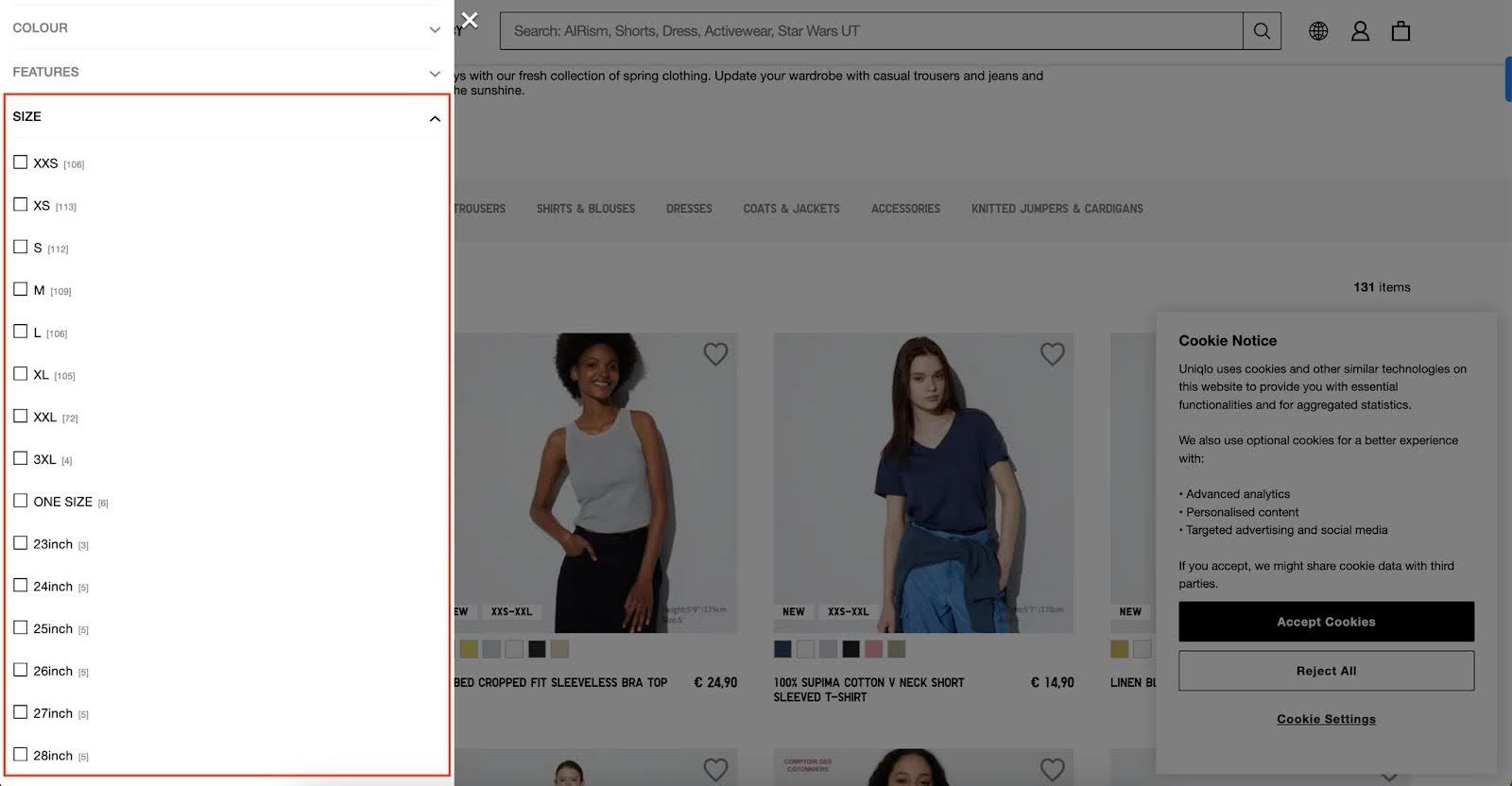
For apparel brands, size filter UX is hugely important to get right. Here’s an example of brands with two very different implementation strategies that will hopefully get this point across. Spot the difference between the two screenshots below: Uniqlo’s menu has a mix of alpha- and numerical sizes - which indicate.. what, exactly? Unclear!
The list is also so long that you can’t even access the whole thing in one go (and don’t get me started on the mobile view):
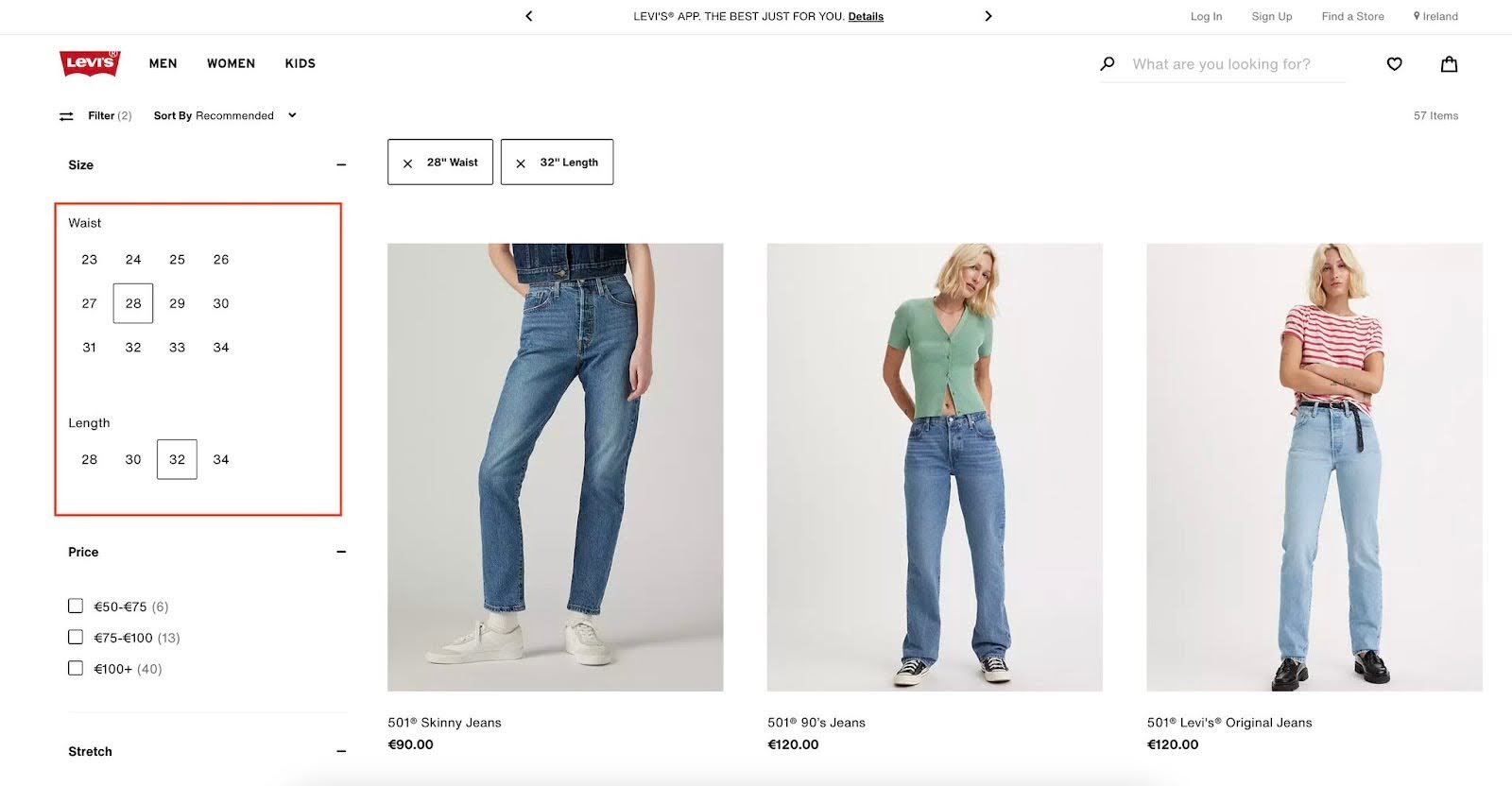
Meanwhile, let’s pivot over to Levi’s website. Levi’s has decided to use their size filters for good, not evil (lol). See how sizing options are clearly labeled “Waist” versus “Length” and all options are visible in one go? And - bonus points - how no products are obscured as you filter?
This is the level of clarity your brand should be aiming for with all filtering, but especially for size options.
I know all of this is easier said than done, but remember: if you’re running an apparel e-comm brand, you NEED to be thinking about size selection UX, or else you’re definitely leaving money on the table.
One more note - since we’re talking apparel, remember, the size filter should always be the first visible filter option, and it should be auto-expanded so that it catches the user's eye. There’s nothing worse than finding a piece of clothing you want to buy - only to learn, too late, that it isn’t available in your size.
Here’s an example from Madewell - in my opinion, the size filter should absolutely not be hidden amongst all the other options:
Don’t put shoppers through this hell! Decrease frustration, and increase conversion rates, by making sure size filters are highly visible, well-organized and intuitive.
Allow multiple filtering options at once
Continuing on the filter theme, it’s critical to allow customers to select multiple filtering options at once. Whether size, color or style, customers often want to mix and match options - and, if they can’t, they’ll have to redo the filtering process multiple times, which results in frustration and abandoned sales.
For example, Bluebella only allows one size at a time to be filtered - a big problem for women who could feasibly be interested in several different size options:
Keep filters sticky
Filters should always stay visible, even as users scroll down the page. You don’t want people to have to rage-scroll - or, even worse, totally give up! - because they browsed for a while and now can’t find their way out of a giant product assortment.
Here’s an example from Zara - note how their filters are technically visible, but very difficult to see as you scroll through the collection page:
Meanwhile, on Vince’s site, the filters are totally gone unless you scroll back to the top of the page, another bad look:
Your job is to ensure it’s always very easy for users to click in, out, and/or filter your collection pages as needed.
Offer “quick add” functionality
For customers who already know what they want, the ability to “quick add” a product to their cart is a huge time-saver. Yet many sites skip this functionality entirely.
You can set up your “Add to Cart” buttons to either appear on hover, à la Levi’s:
Or, if your page design allows - and it doesn’t look too cluttered - you can display the buttons directly beneath each product. Glossier has done a great job of this:
Show product above the fold
When a customer hits your collection page, they should immediately be able to see shoppable products. (This goes for both desktop and mobile views.) Products encourage shoppers to keep scrolling; huge header images can make them feel stalled.
As an example, here’s how INBLOOM’s collection page looks, on both desktop and mobile:
The mobile view is slightly better (although the pop-up video is still obscuring a product) - but either way, this is way too much screen space taken up by a header that could be used for more shoppable options! Give the people what they want - let them get to your products fast.
Simplicity is key
This tip is last, but certainly not least. Collection page design is a balance between sharing critical information - price, appealing imagery, social proof - while also keeping things as streamlined as possible to avoid overwhelm. You never want to overload users with unnecessary design details, too much copy, or the wrong type of information.
Let’s take another look at Uniqlo. I appreciate that they’re trying to share a lot of information - like product size ranges, which is critically important - but the overall look is quite cluttered, especially on mobile.
For example: does each product need to have a giant heart icon in the corner? Couldn’t those appear on hover? And - see the tiiiiny copy in the bottom right corner of each image? It’s sharing each model’s weight and height, which is helpful - but really doesn’t need to show up on the collection page:
Remember that there is such a thing as too much information, and make sure you’re being ruthless about what needs to show on collection pages versus product pages.
A note on product sorting
You don’t just want your collection pages to look good and work well. You also need products to be sorted in the most logical way possible. Take some time and think through your product sorting: do you have specific collection pages per product type? Have you considered creating specifically curated manual collections, like for new products or a specific product functionality? Think through the most user-friendly assortments you can offer, and ensure they’re set up properly to ensure a smooth on-site experience.
Collection pages are also a great place to highlight on-trend products. Want to learn more about the strategic benefits of harnessing trends? Read my article on using trends to gain web traffic.
Ready to test your collection page design?
If you’re keen to make site updates and want to see how your site’s new UX performs, I highly recommend installing a heat map tool like Hotjar or MS Clarity. Either option allows you to track real-life user behavior on your site, and see where and how users interact with specific pages. They also pull in a lot of super-helpful data, like rage clicks - aka areas where users get stuck and begin, you guessed it, rage clicking.
Ready to learn more about conversion rate optimization for your e-comm brand? Subscribe to my newsletter and you’ll receive a free course on CRO.
Have questions? Need help optimizing your own site’s UX? Get in touch. I answer all messages personally.


