A CRO Audit of the Uniqlo web redesign 🛍️
Note: this site audit is a repost from a series I run via my newsletter, Add to Cart. I got a great response to this audit both via LinkedIn and my newsletter, so thought it would be helpful to share as a standalone post. Enjoy - and, if you like what you read, make sure to subscribe to the newsletter to get these audits directly in your inbox!
Welcome to the Style to Sales Audit! In this series, I pick a real e-comm brand and conduct a CRO (conversion rate optimization) audit on their site. This includes reviewing the site’s UX, content and more, as needed. My goal is to show exactly how I’d work with the brand to improve their conversion rate - as in, turning more of their site’s browsers into buyers.
Today we’re auditing Uniqlo! Uniqlo is my fast-fashion drug of choice - I love their androgynous, minimalist clothing. Their site has never worked great - full disclosure, I’ve had them on my to-audit list for a while now - but they recently launched a redesign that is so difficult to use, I feel personally targeted.
Seriously - if you don’t believe me, click over to their site and take a moment trying to get from the homepage to a product that you’d actually want to purchase. It’s almost hard to believe how bad things are working over there at the moment. But I promise I won’t spend the whole audit griping - I really do want to give you some actionable takeaways about what can (and should!) be done differently here.
Ready? Let’s dive in.
Homepage
The new homepage design certainly looks cool at first glance - apparently one of the motivations behind this redesign was to align the site’s aesthetics more closely with the Uniqlo mobile app. Unfortunately, aesthetics are where my positive comments end.
I initially tried clicking the top category links, assuming they’d pull up a navigational menu - but nothing happened, other than a different hero image. Then I tried clicking the brand icon at the top left - still no menu. I already felt very frustrated. (Just give me my season order of boxy striped long sleeve t-shirts!!)
Next I tried clicking the magnifying glass icon (middle bottom of the screen). Finally, something happened: instead of a search bar, a really strange full-screen menu page pops up:
Now that we’ve solved the mystery of how to actually access products - do I have any other burning thoughts on this homepage? I do like the full-screen editorial images and think they highlight the products in a really compelling way. I also really wish the top links were omitted, since they don’t do anything in practice (besides change the hero image) and I bet they’re already generating a ton of rage clicks from confused customers.
I am all for minimalist website design, as long as the design actually works in an intuitive way. It’s already very clear to me that this isn’t the case for the new Uniqlo site.
So let’s move on to the elephant in the room: the site’s new navigational structure, which revolves around that tricky magnifying glass icon.
Menu
Please note, this full-screen menu page is now the only navigational option on-site. To find it from any page, you have to click in through the magnifying glass icon (which now hovers at the bottom of every page).
Let me make this very clear, if it isn’t already: a navigational menu serves different functions from a search bar! Anyone who’s ever used a website to shop for products (IE all of Uniqlo’s online users) knows the difference between those two functions.
There is a line between making something that’s innovative and something that’s just too far out of the box for customers to understand, and I fear Uniqlo has crossed that line. You need to make it as effortless as possible to navigate your site. Hiding your entire menu is not a good way to do this.
I also find it confusing that this menu structure mixes together product categories with other types of search options, like designer collabs or new arrivals:
On mobile view, you have to scroll to even see all the categories, but there’s no visual indicator that there’s more information below the fold. (I highly recommend keeping your site’s mobile menu to one screen only, but if you must extend it, you need to ensure that users know they’ll see more if they scroll.)
It’s also very strange that to exit out of this pop-up, you have to click the “X” icon in the middle bottom of the page - a place most people wouldn’t intuitively think to look. (Uniqlo, why are you trapping us??)
Now, immediate UX concerns aside, let’s talk about an even more concerning aspect of this menu redesign: the accessibility factor.
Menu Accessibility
Fresh Egg wrote a really great breakdown of the issues with Uniqlo’s new website, and I suggest you click through and read the whole thing.
The main issue I want to highlight here is that the new website navigation page is virtually unusable for anyone who uses a screen reader (or keyboard navigation) due to the lack of visual menu hierarchy. In practice, this means that adding anything to your cart while using a screen reader is now virtually impossible.
It’s genuinely concerning that a brand as large and well-resourced as Uniqlo didn’t consider the implications of a site redesign that’s inaccessible to so many.
To fix these issues, they’d need to build a much clearer navigation structure with heading tags designating a content hierarchy. (By the way, this would be much better from a general UX perspective as well.) Fingers crossed this is fixed ASAP.
Collection Pages
Assuming you ever make it through the maze that is this menu redesign, you’ll find yourself landing on a collection page.
Uniqlo is one of the only apparel brands I’ve seen that follows Baymard’s top-5 rule for collection pages, which shows (using research!) that the most important pieces of information to have on a collection page are as follows:
Price
Product title
Thumbnail image
Product ratings
Any variations (like colorways)
Not every product on Uniqlo’s site has reviews, of course, but lots do:
So, kudos to Uniqlo for that! Providing social proof (like product reviews) at the collection-page level is a great way to encourage users to shop further. That being said, this collection page feels so messy to me. The overall minimalist vibe of the homepage just didn’t translate over to individual collections.
For starters, those ever-present floating icons at the bottom of the page are killing me. They cover up important information!
But also, why - on an online store - do we need the “Only in Select Stores” copy? I can see the benefits of including that info at the product page level, but not on collection pages:
Another big UX issue (which also impacts accessibility) is the lack of breadcrumbs at the top of collection pages - meaning there’s no easy way to back out of a collection page to other types of women’s product categories, for example:
Continuing with the theme of “visual overwhelm,” I also don’t think collection pages need “Sort by” and filtering dropdowns - why not simplify and pick one system or the other:
Instead of offering specific filter options like “Top Rated,” I’d rather see badges added to relevant product photos, like Glossier does:
Product Pages
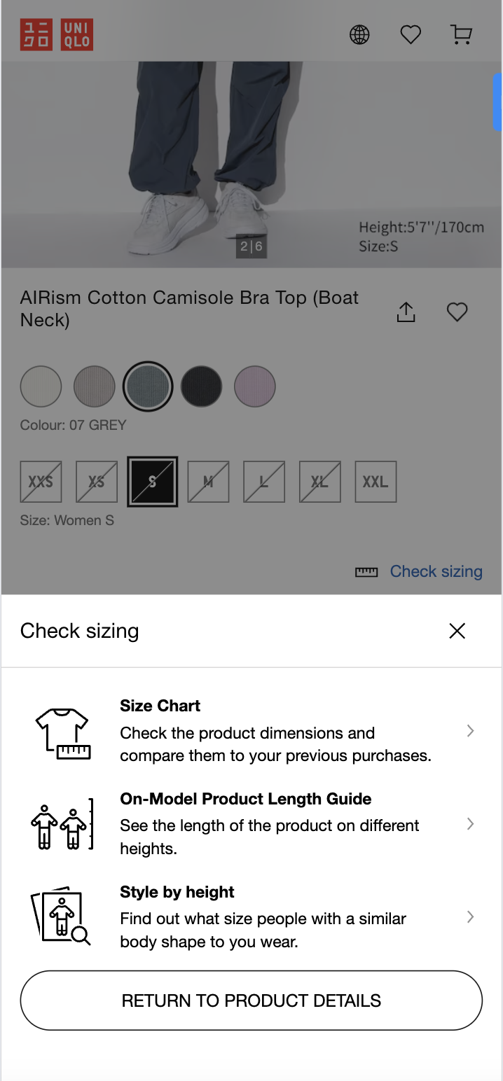
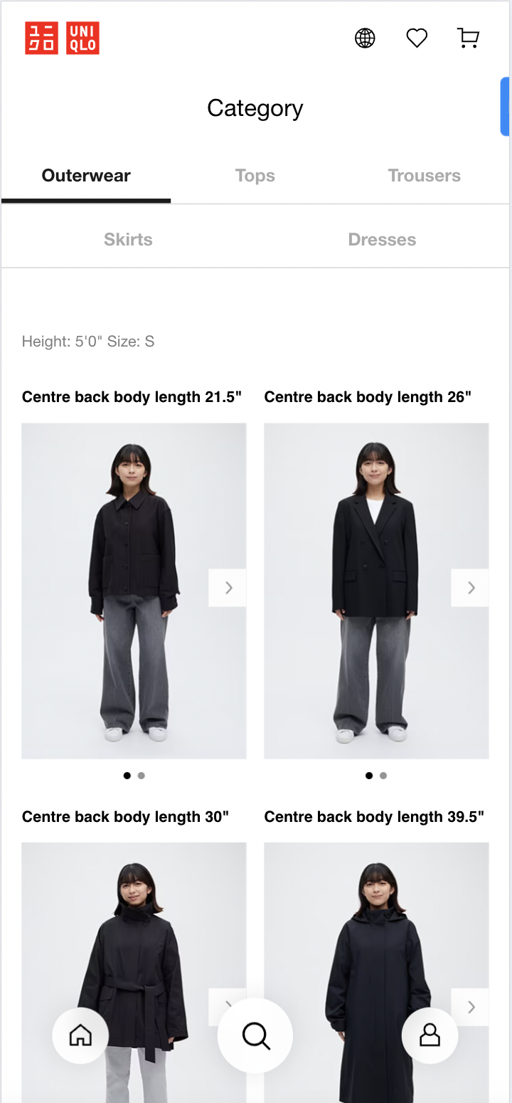
This audit has already gone long, so I’m going to skip a full breakdown of the brand’s product pages. But I do want to give kudos to the amount of sizing info that Uniqlo has available (even if it’s clunky to access):
If you’re willing to click around, you can find not only detailed size charts, but also on-model photos of different product lengths, as well as height guidance:
The problem, though, is that yet again there are no breadcrumbs that allow you to exist these size guides and return to the product you were browsing. Uniqlo is, overall, missing a lot of opportunities to keep customers engaged in the browsing process. It just shouldn’t be this hard!
Outro
Uniqlo dropped a press release introducing this new redesign, describing how much easier the navigation is to use. They also ask for feedback, but only in the format of a “Like!” button:
That’s more than a little bit biased. I really can’t help but wish we could see comparative analytics for the old site versus the new. And, of course, this is your perennial reminder that A/B testing exists for a reason - you should always use A/B testing to help you make data-backed decisions when redesigning your site.
I posted about this redesign on LinkedIn and people had thoughts. Here are a few of my favorites:
Including this super-helpful insight about the connection between the app and the site redesign - thanks, Jana!:
For the record, here’s a snapshot of some of Uniqlo’s recent app reviews. Uniqlo, I am literally begging you to listen to your customers:
Whew! That’s it for today, folks. Thanks for reading and, remember, if you liked this audit, make sure to subscribe to my newsletter!
Have questions? Need help optimizing your own site’s UX? Get in touch. I answer all messages personally.


