A CRO Audit of the Zara website

Note: this site audit is a repost from a series I run via my newsletter, Add to Cart. I originally wrote this audit in July 2024. I’ve gone through and refreshed it with additional notes and screenshots where relevant. The site hasn’t changed much in that time, but it felt worth mentioning since you’ll see a mix of old and new screenshots.
Enjoy - and, if you like what you read, make sure to subscribe to the newsletter to get these audits directly in your inbox!
Welcome to the Style to Sales Audit! In this series, I pick a real e-comm brand and conduct a CRO (conversion rate optimization) audit on their site. This includes reviewing the site’s UX, content and more, as needed. My goal is to show exactly how I’d work with the brand to improve their conversion rate - as in, turning more of their site’s browsers into buyers.
Today, we’re chatting about Zara. I’ve been trying to wean myself off a Zara obsession for years at this point, but that doesn’t stop me from stumbling across their site pretty frequently. And, each time I do, I’m struck by the fact that their site just doesn’t work very well.
And listen, I know what you’re thinking - this brand is wildly successful, whether or not they have great UX. (As of 2022, Zara was still making ~65% of its sales in-store rather than online.) But I still think there are some useful takeaways here, even for much smaller brands.
Why? Because Zara’s website is emblematic of a current ~look~ in web design. It’s hyper-minimalist, with tiny fonts, neutral colors, and loads of negative space. But just because a site’s design is on-trend doesn’t mean it works well.
Remember: even if you have an empire of physical stores, like Zara does, you do still need your site to work smoothly so that it encourages sales.
With all that said - let’s dive in!
Homepage
First things first - I love the high-contrast green color that Zara is using to advertise their semi-annual sale. Zara is such a well-known brand that they don’t need to do much more to draw in customers, so I’m pretty happy with this extremely minimal homepage design (even if I normally wouldn’t suggest this approach for smaller brands):

That being said, things get trickier once I actually try and navigate my way to some shoppable products. I’m really not a fan of this strange floating menu on desktop:

This brings me to a key recurring theme of this audit - text and navigation elements are just really small on this site. I know that the scaled-back minimalist look is trendy right now, but it needs to be balanced with usability. In the case of this menu, I’m already starting off my browsing experience feeling like I have to squint to even access products.
March ‘25 note: when there’s not a sale on, the site’s homepage looks even more minimal:

It’s worth reiterating that you can easily go overboard with tiny design elements. Factory Pattern did a test on Zara’s homepage and found that it takes users an average of 5 seconds to figure out where to click. This is far too long, especially in the hyper-competitive fashion space, and I bet larger (and clearer) navigation elements would help a lot.
Menu
Both the mobile and desktop menu designs require you to swipe left to right (to access the top row of links), versus up and down (to see the rest of the category links):
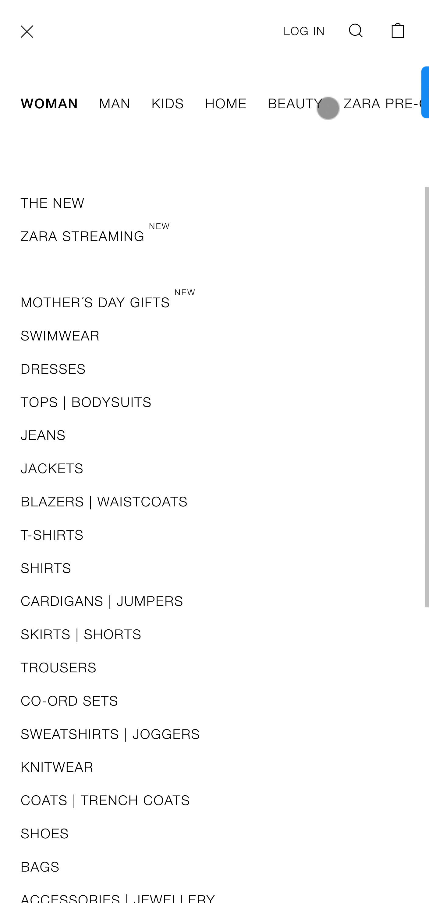
This is a really confusing way to structure a menu, and it’s very hard to use on a phone screen. There’s also not a clear organization to the category links - for example, why is “Jackets” its own section versus “Blazers | Waistcoats”?
Overall, Zara’s menus feel like they were thrown together without much thought, when in reality, clear menu design is a key way to improve conversion rates. If customers can’t access what they’re shopping for super easily, they’ll likely go find it somewhere else.
In contrast, take a moment to rest your eyes on Everlane’s mobile menu, which is much more streamlined, has larger and more organized elements, and just looks better:

Collection Pages
Collection pages are critical to optimize for conversion because they’re the first landing point of any serious shopping journey. Yet Zara’s default view for mobile collection pages is SO chaotic. I notice that you can change the formatting to larger images, but WHY does it default to this tiny grid:

After switching grid views, I can see my options much better, plus pricing and add to cart options are now available. But the Search bar is, again, really difficult to use, since it’s transparent and intersects with product information:

March ‘25 note: I’m happy to see that the teeny-tiny collection grid has been retired and replaced with a more spacious design (even though I’d omit the descriptive copy in favor of more product visibility above the fold):

Then, if you actually try and click into the “Search” bar, you’re taken to an entirely new page, with a different selection of products. I’m not sure what the rationale for this is, but it’s annoying for customers to be taken away from the area they were browsing, especially on a site this giant:

I appreciate that Zara has “Quick Add” functionality on their collection pages - including on mobile view! - but the UX is (also) a bit chaotic. First of all, the plus signs to indicate this option are tiny and a bit hard to see. Then, the pop-up that opens is super cluttered - with additional product images, links to a size guide, and more - which kind of detracts from the “Quick” appeal:

Let’s contrast this experience to Mango’s quick-add UX, which is just much cleaner:

Overall, as I browse Zara, I get the feeling that they just haven’t given much thought to how users actually interact with their site. This is obviously not detracting too much from their business model, but for smaller brands, having a well-functioning site can be extremely make or break in generating new sales. Long story short: think about your customer’s needs. Don’t be like Zara.
Product Pages
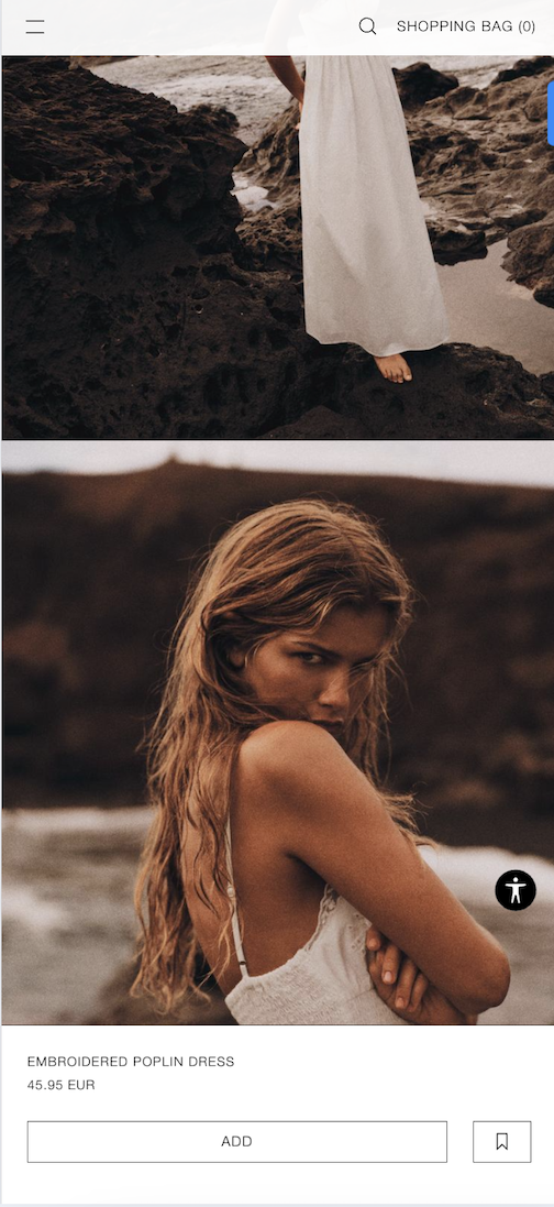
I like the minimalist, image-forward design of the mobile product pages. I also like that the “add to cart” button is sticky, and moves down the page as you scroll:
There’s a really nice pop-out sizing guide on desktop view - essential for any apparel site, especially one with so many product types - but for some reason I can’t find it on the mobile view:

March ‘25 note: I spent some additional research time on Reddit and found lots of threads (like this one) complaining about the lack of basic info on product pages - things like the model’s height and what size they’re wearing. Since Zara cycles through styles so quickly, there’s not a lot of opportunity to collect reviews, so they should be even more thorough in including sizing info. Unfortunately, that’s mostly missing.
Another huge red flag for me is clicking into the “Composition” section on a random clothing product, and seeing no concrete fabric information, but instead this strange word salad-y note about “continuous improvement”:

Obviously, Zara has been called out for their greenwashing practices many times at this point - I’m not calling out a new concern here. But I do just want to remind you that not only do your customers care about fabrication information, but increasingly, legal requirements across the EU (and soon the US) are going to be mandating this information be accessible. If your brand cares about ethical sustainability messaging, then you’ll love my guide to telling better sustainability stories.
Cart
Zara’s mobile cart view is visually clean, but, again, the elements are super tiny on mobile:

There’s also an additional login screen before you can get to order info - I’d prefer to see the login option integrated into the checkout flow, like after you’ve input your email:

I really wish we could see internal data on how many users drop off at each stage of the checkout journey, as I see that - for Guest checkouts - there are several more pages of required info. Zara is running a headless site, but I have to say, they’d really benefit from Shopify’s one-page checkout. (Shopify - sponsor me 😉)
Whew - I think that’s everything for now!
Have questions? Need help optimizing your own site’s UX? Get in touch. I answer all messages personally. And, if you liked this audit, check out my other ones on Uniqlo and H&M.