A CRO Audit of the H&M website

Note: this site audit is a repost from a series I run via my newsletter, Add to Cart. Enjoy - and, if you like what you read, make sure to subscribe to the newsletter to get these audits directly in your inbox!
Welcome to the Style to Sales Audit! In this series, I pick a real e-comm brand and conduct a CRO (conversion rate optimization) audit on their site. This includes reviewing the site’s UX, technical specs and more, as needed. My goal is to show exactly how I’d work with the brand to improve their conversion rate - as in, turning more of their site’s browsers into buyers.
Today we’re auditing H&M. While I’m not personally a fan of the brand due to their shady production practices, I’ve browsed the site enough times (and heard enough people in my network complaining about its functionality) to know it needed to be the subject of a deep dive. There’s a lot to unpack here!
As of 2023, H&M made about 30% of its sales from online shoppers, indicating that brick and mortar is still the brand’s main profit driver. I think this is the case for lots of large fast-fashion brands, which could explain why their UX is still so behind the times. Just a hypothesis! As many strange men on LinkedIn have reminded me recently, I don’t actually have backend data on the brands I audit 😉
I hope you can pull some useful takeaways from this guide that may apply to your brand’s own site. And remember - A/B testing is key for any CRO adjustments you make!
Okay, on to the audit.
Site Performance
First off: I noticed while browsing on mobile that images seemed to be loading super slowly. So I ran a PageSpeed Insights test (hot tip: this is a great free tool that all brands should be utilizing!) - and H&M’s site failed for mobile performance.
The biggest issue? Images that take too long to load, with an average load time of 1.7 seconds on mobile. Additionally, large layout shifts during loading mean that users can easily lose their place as they start to scroll.
Site speed is a huge factor in conversion rate optimization. Per Bidnamic, conversion rate improves by 17% for every second shaved off loading time. Google is also increasingly rewarding lightning-fast sites in its organic results.
With all this in mind, I’m really surprised H&M would allow their mobile performance to be so slow. On my phone I encountered significant delays loading collection and product pages specifically.
Homepage
H&M’s homepage is visually striking and emphasizes their ultra-low prices via a subtle price tag on key products:

I typically like to see two things from an e-comm homepage:
Attention-grabbing copy that gets straight to the “point” of the brand
At least some shoppable product above the fold, to encourage scrolling
In H&M’s case, neither of those things are present, but I think it’s clear they are relying on a level of existing brand recognition. They aren’t going to explain their product assortment to you - in fact, if you want to access other broad categories, like Men’s or Kid’s, you need to click into them at the top of the page to see a new hero image and menu options.
For smaller brands, I definitely don’t suggest taking this approach, but I will admit this homepage looks very aesthetically clean.
Menu
At first glance, I find H&M’s mobile menu to be unnecessarily complicated.

I’d be really interested to see user heatmap data (I like Hotjar or MS Clarity) on how this menu performs, because it combines a few features that I find confusing from a UX perspective:
A full-screen layout (that you have to X out of to resume browsing)
Horizontal AND vertical scrolling
Additional pages’ worth of category dropdowns
Contrast this to GAP’s navigation, which manages to be a bit more streamlined, with all-vertical scrolling and dropdowns per major category:

For brands with huge product catalogs, like H&M, there’s truly no one-size-fits-all approach to designing a menu. However, I do suggest sticking with vertical scrolling only, as it makes for a much more intuitive mobile experience. I also think menu pop-ups (versus full-page designs) make the shopping experience feel much more seamless since it’s easier to back in and out.
Collection Pages
H&M’s category pages look great at first glance - but what if you want to filter deeper than just “Women’s Tops”?
Yikes. Sub-categories are only accessibly by this never-ending horizontal menu:

You’re probably noticing a theme at this point, but: you don’t really want to mix in horizontal scrolling like this on mobile. This design makes it impossible to see sub-category options at a glance, which is just really confusing user experience. And, on a site with hundreds of products per category, it’s important to make navigation as streamlined as possible.
(Also, notice how the same buttoned top is shown separately in two colorways?! This is so cluttered! Come on, H&M!!!)
I also notice that review averages are missing from collection pages. Not all products will have reviews, of course, but for those that do, a starred average should be displayed below the product price. This type of social proof is super helpful in converting browsers to buyers.
Product Pages
I notice two things when I land on H&M’s product pages:
It isn’t intuitive to figure out how to view other images
I can’t select a product size without scrolling

Let’s compare with Glossier’s product page design, which manages to pack in a lot more helpful information in the same amount of space:

Obviously, Glossier doesn’t have product size options to contend with, but there’s a lot to appreciate about their layout: the product is shown by itself and in a styled image, there’s review data available, and image scrolling is much easier (with thumbnails visible).
For H&M, I’d reduce the hero image size on all PDPs and add in thumbnails underneath à la Glossier, move the product price onto the “Add to Cart” button to save space, and ensure a size selector is also visible above the fold.
Next up, let’s talk upselling. With low price points and huge product catalog like H&M’s, upselling should be a top concern. I find the “View products” button (on the hero image) to be distracting and not entirely clear - what exactly will happen if I click?

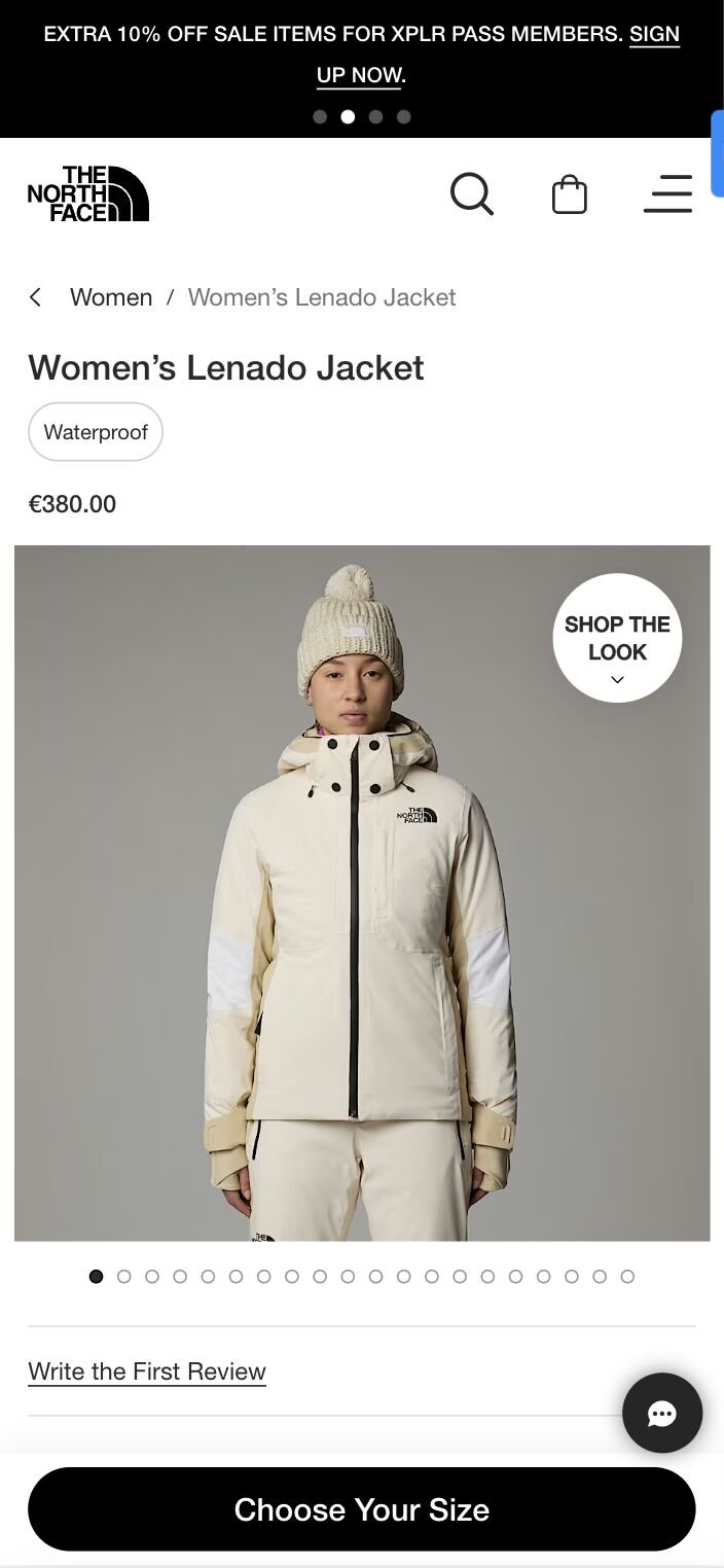
To clarify, we could switch the micro-copy to say “Shop the Look,” the way The North Face does:
Once I open the “View Items” pop-up, I actually like what I see - there’s even an additional dropdown of similar items to browse. I just think it needs to be more intuitive for customers to access this upsell area.

We haven’t hit on desktop experience much in this audit, but it’s worth noting that images crop strangely on desktop, and once again, it’s not intuitive to find additional browsable product images:

Cart Page
H&M’s Shopping Bag is on an entirely different page, rather than formatted as a pop-up. I tend to prefer pop-up cart views since they make it easier to resume the shopping flow. What concerns me more, though, is that if you have multiple items in your cart, you have to scroll to find the “Checkout” button:

I always recommend floating “checkout” buttons to avoid this exact issue on mobile. You want to make it as seamless as possible for your customers to complete their purchase!
I also found myself confused by the “out of stock” notification as it wasn’t entirely clear which product was no longer available. Upon further inspection, I realized it was the Cropped T-Shirt (it looks like the photo was slightly lightened, and there isn’t quantity adjustment available any longer) - but this could be much clearer at a glance.
Whew - I think that’s everything for now!
Have questions? Need help optimizing your own site’s UX? Get in touch. I answer all messages personally.